PROBLEM
SOLUTION
DISCOVER
Briefing · Survey · Quantitative Research
DEFINE
Personas · SMART Requirements · AI
DEVELOP
Wireframes · Design System · Prototype
DELIVERY
Final UI · Usability Test
Methodology: Double Diamond — British Design Council, 2005
discover_
The project began with a direct briefing from the creator of Bandoneón Initiative, a social project focused on itinerant culinary education for people in vulnerable situations. The mission was to transform this in-person work into an accessible, practical, and engaging digital product.
To understand who the users would be, we conducted a quantitative survey with the target audience. The data revealed behaviors and preferences that challenged the initial assumptions.
prefer recipes with short videos and subtitles
want to learn more than the basics
The most used apps by respondents were social networks, which ended up indicating the need for some approach to interaction and dynamics. With this, it was observed that the content needed to be fast, visual, and progressive.
define_
PERSONAS
With the research data, we built three personas that represented the distinct profiles identified. The challenge was to design for all of them without compromising the experience of any, they are:
Pedro, 20, streamer
Wants basic kitchen autonomy and a healthier eating routine. Consumes everything via social media, has limited time and prefers quick and visual content.
Anna, 24, journalism student
Intense routine. Need to find recipes quickly, being practical for everyday use, prepared on weekends. Want complete descriptions, without interruptions.
Cooks for the family in large quantities, with a focus on health. Wants to involve the children in the process and avoid waste.
REQUIREMENTS · SMART CRITERIA
To consolidate the findings and avoid ambiguity in the development stage, the requirements were organized into four dimensions and evaluated according to SMART criteria, ensuring that each product decision was Specific, Measurable, Achievable, Relevant, and Time-bound.
PRODUCT GOALS
· Teach gastronomic techniques and terms
· Encourage healthy eating and waste reduction
· Organize recipes and chef content
· Stimulate culinary creativity
USER'S NEEDS
· Learn to cook with progression
· Practical recipes for everyday life
· Follow a healthy diet
· Have autonomy in the kitchen
· Follow the initiative's itinerary
CONTENT
· Recipes with text and illustrative images
· Personalized user profile
· Project presentation and updates
· User feedback about their results
FUNCTIONAL SPECIFICATIONS
· Save recipes in personalized folders
· Filter by difficulty (easy → difficult)
· Mark ingredients to buy
· Recipes with reader, sounds, timer and images
INFORMATION ARCHITECTURE
With the requirements defined, we mapped the complete structure of the app from onboarding to the profile area, going through the revenue flows, filtering, shopping list, and social interaction.

Information Architecture — complete structure of the Bandoneón application

develop_
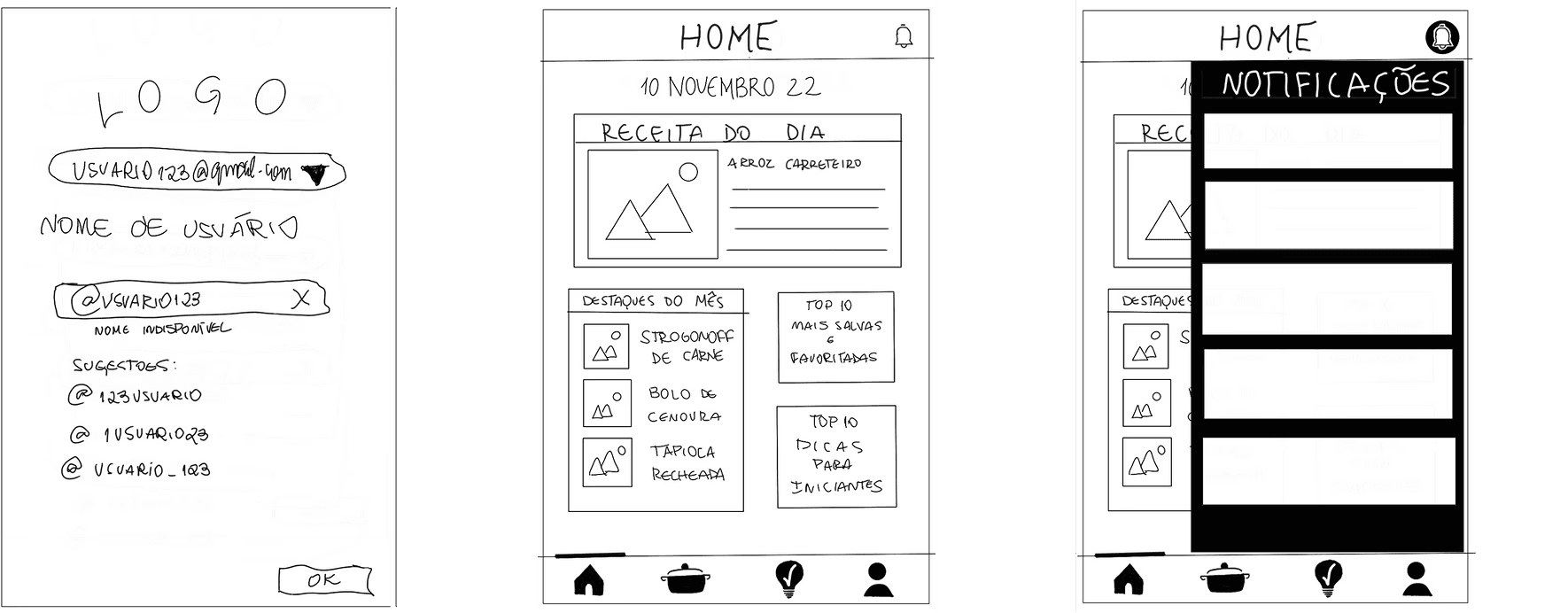
With the architecture defined, the process began in low fidelity — drawing on paper the critical flows before any visual decision. This stage was essential to validate navigation without the aesthetic weight of the UI.
WIREFRAMES
Paper wireframes — exploration of flows before any visual decision
The wireframes covered the priority flows: account creation, home with daily recipe, navigation by categories, individual recipe screen, and notifications area. The bottom tab navigation with 4 sections (Home, Recipes, News, Profile) was defined at this stage and maintained until the final version.


DESIGN SYSTEM
The design system was built in Figma based on the Bandoneón Initiative's visual identity — green and wine as primary colors, Nunito as the primary typeface, and rounded formats.
TYPOGRAPHY
Nunito
· Black 900 — titles
· Bold 700 — highlights
· SemiBold 600 — subtitles
· Regular 400 — body
· Line spacing: 1.5×
COLOR PALETTE
#829d24
#aace26
#dfdd21
#ce1d20
#7a211e
COMPONENTS
Medium-stroke iconography without fill. Rounded formats in cards and buttons. Reusable components: recipes, categories, notifications and profile.
Design System — palette, typography and components of the Bandoneón application

delivery_
With the design system established, the final screens were developed by applying each component decision and color token consistently. The result was a navigable prototype tested with colleagues, teachers, and with the creator of the initiative himself.
FINAL UI


USABILITY TEST
The prototype was tested with colleagues, professors, and with the creator of the Bandoneon Initiative. The most praised points:
· The step-by-step mode with timer responds to the preference for guided content identified in the research
· The organization by categories with difficulty filters serves both the beginner and those who want to advance
· Onboarding by interest personalizes the experience from the first access
The creator of the initiative recognized in the product a faithful representation of the project's mission.
outcome_
End-to-end process
research → personas → AI → wireframes → UI → DS → prototype → test
Real customer involved
briefing and final validation with the founder of the Bandoneon Initiative
Scalable system
design system with typography, palette and components ready for product evolution
This was the project where I learned that UX begins long before Figma is opened. The quality of the final product was directly proportional to the quality of the questions asked at the beginning — in research, in briefing, in requirements definition.
Each screen existed because there was a real need behind it.
NEXT PROJECT